Welcome all Content Managers! We’re here to help! If you have any questions or problems, please email the entire creative services team for best response! You can open a ticket with our team by emailing creative@trinitydc.edu. This page will help you troubleshoot working with our WordPress system, and successfully update your content on the website.
Trinity uses a NETWORK of individual WordPress websites — which we refer to as SUBSITES. Most subsites are similar to the others, but there are small differences between some of the subsites. There will be differences between what the dashboard looks like for different subsites. You can also only manage content on subsites you’ve been added to as an editor. Please be familiar with your own subsite, and allow your content manager colleagues manage their own subsites.
Important notes to all content managers about file & data security/integrity on the Trinity website:
Trinity’s website is NOT designed to adequately act as file storage or data storage. Trinity’s Technology Services can work with your office on dedicated solutions for file and data storage. Please do not rely on the Trinity website to save content, data or files in perpetuity! You are responsible for making sure that you have secured a backup of ANY AND ALL text, data or files you have uploaded or added to the Trinity website. This includes images uploaded to the Media library, webpage content, PDFs, Word Files & Excel Files, etc. This also includes data collected through Gravity forms built into the website. If your department’s subsite has Gravity Forms, we can provide you with training on how to log in and download CSVs of the data on your schedule.
Our WordPress build NO LONGER SUPPORTS ROLLING BACK OLD REVISIONS OF YOUR PAGES. Save any important text in a separate document if you think you will need it again in the future. WE CANNOT ROLL BACK PAGES TO OLD VERSIONS ANY LONGER.
Please do not use the website as a repository for data, content, or files. It’s not designed for this task, and Creative Services cannot be held responsible for data, content, or files lost. We recommend Google Drive as a resource for storing images, documents and content that need to be kept long term.
Creative services regularly performs backups of our database for the purpose of full site restores, but retrieving specific data from these backups becomes exponentially more difficult the longer the time has passed from when the data was lost. The best time to restore this data is in the moments or even hours after the data has been lost. After a few days, because of the way the WordPress database works, and because of the constantly changing nature of our website, this becomes an extremely difficult task. Please upload and add responsibly!
WordPress Content Manager Basics
Getting started with WordPress
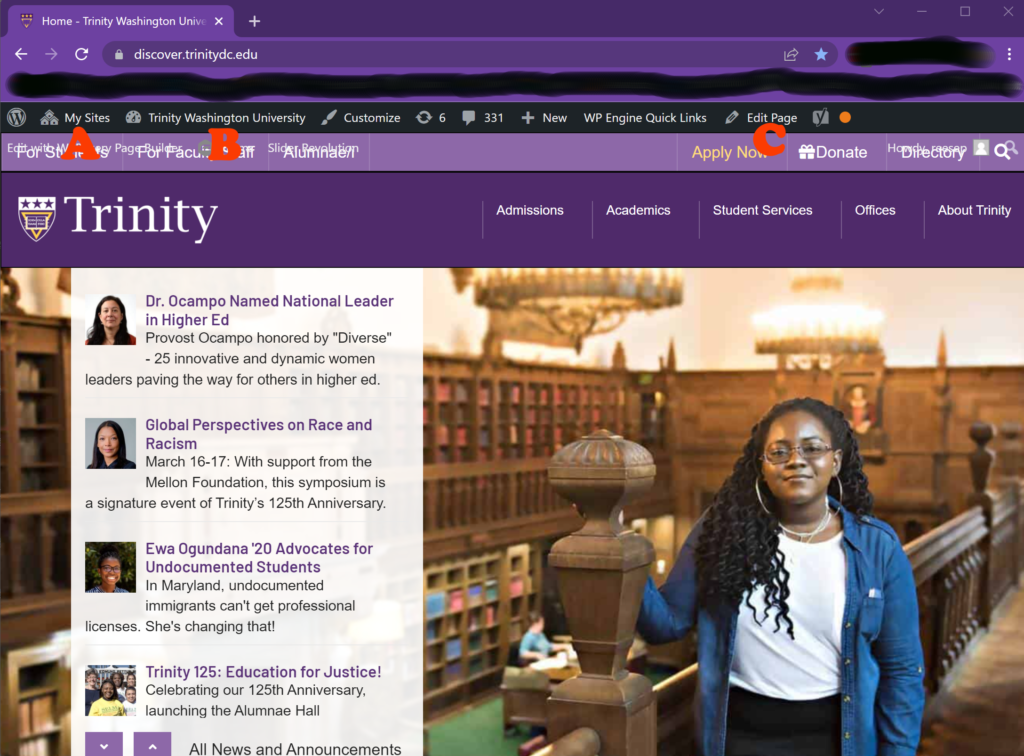
Quickstart Button
(hover over to access floating menu)
Log into WordPress
To log into WordPress, visit https://discover.trinitydc.edu/wp-admin or go to your subsite’s homepage and add “/wp-admin” to the end of the homepage URL and enter your Trinity username and password.
The WordPress quickstart bar
A. “My Sites:” If you are a content manager for multiple subsites within the Trinity Network, you can switch between the various subsites here.
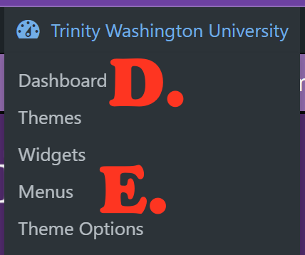
B. Quickstart button: Access your dashboard and important other important functions here.
C. “Edit Page:” Quickly shift to editing a page or post as you are on it, without having to do a search for pages in the dashboard. For more on editing pages, click here. For more on editing posts, click here.
D. “Dashboard:” Access the dashboard from this button to manage all of your WordPress content. For more on navigating the dashboard, click here.
E. “Menus:” If you are trained on menus (most content managers will not be) you can quickly switch to the menu editor here. If you are not trained on menus PLEASE do not try to edit them without Creative Services’ help. For more on editing menus, click here.
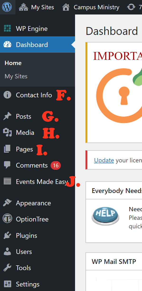
Dashboard Navigation (NAV) Menu
The three most important types of content are POSTS, PAGES, and EVENTS. Evergreen content like office staff and contact information, ongoing programs, and the like are best placed in pages. Announcements, content that will become obsolete in the foreseeable future, or blog posts chronicling goings on are best for posts. Posts show up in a chronological list from most recent to oldest. Events are things coming up in the future that need to be publicized. Media can be placed in all three.
F. “Contact Info:” Quickly update the contact info that displays at the top of pages across your site. For more on editing your office contact info, click here.
G. “Posts:” Access your news/blog posts to add new posts or edit existing posts. Posts are good for content that is not evergreen, covers current events, or will expire/become obsolete in the foreseeable future. To get started with posts, click here.
H. “Media:” Access all media (images or PDFs NEVER AUDIO OR VIDEO FILES) uploaded to your subsite, or add new media.
I. “Pages:” Access all your subsite pages for editing. Be cautious about adding new pages and evaluate whether adding content to an existing page would be more appropriate. Pages are appropriate for evergreen content only, other content should be placed in posts or events. To get started with pages, click here.
J. “Events Made Easy:” Add and edit your upcoming events here. Events are content that has a specific start and end date in the future.
Updating your Office Contact Information
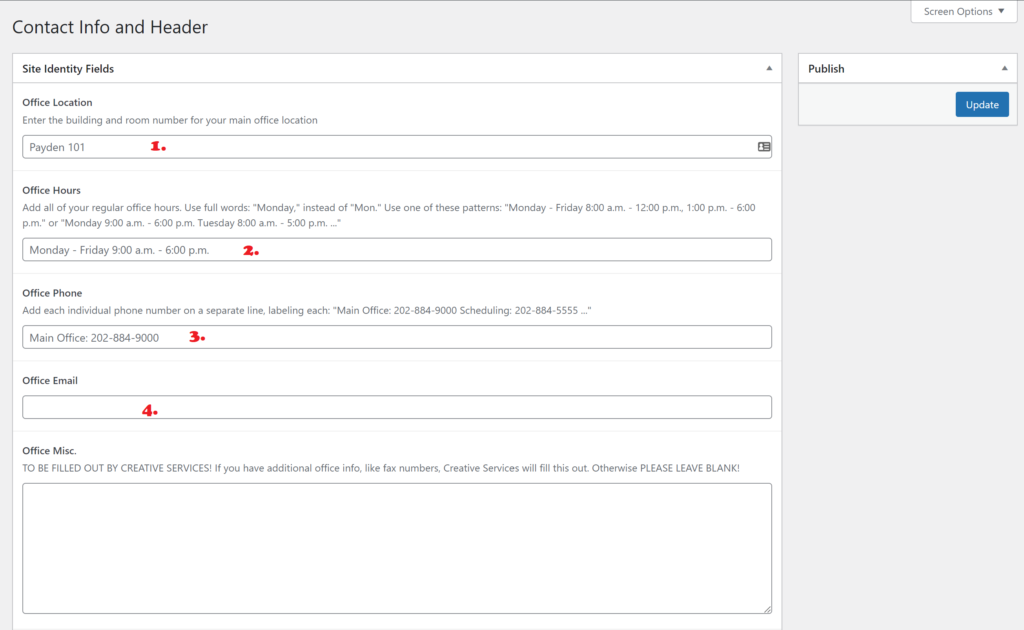
To update your Office Contact Information, click the information icon (a lowercase “i” in a solid circle, F.) in the left WordPress Dashboard navigation, which will take you to this simple form.
1. Enter your office’s location. Locations are room numbers within Payden, Main, Library, Alumnae, Cuvilly, Kerby, TheARC, or Trinity Center. Please don’t get creative with place names, use these ones, as it will mirror what other offices are listed as, and will eliminate confusion for visitors.
2. Enter your REGULAR, NON-HOLIDAY office hours, using the full day-of-the-week name for the first day a space, a hyphen, another space, and the full day-of-the-week name for the last day, followed by a 12-hour clock (NOT 24 HOUR CLOCK) hour and minute for start of day, a space, and either “a.m.” or “p.m.” in lower case, with periods, a space, a hyphen, another space, and the 12-hour clock hour and minute for end of day, with “a.m.” or “p.m.” If you have special or holiday hours, please include that in text in your homepage content instead of here. Putting too much information in this box may cause the office information section to overflow weirdly.
3. Enter your office telephone number without parentheses with three-digit area code, hyphen (no spaces), three digit exchange code, hyphen, four digit subscriber number and an optional “ex.” for extension. For example: “202-884-9000 ex. 4.” If you have multiple TELEPHONE numbers (not fax) label each and put a space between. example: “Main Office: 202-884-900 Scheduling: 202-884-5555.”
4. Enter the SINGLE email address that sends email to your main inbox. If your office does not have a main inbox, then use the director’s email address, or the receptionist’s email address. Do not label this, our technology will turn this into a clickable link, but entering any characters other than the raw email address will break this. Example: “ouroffice@trinitydc.edu” DO NOT ENTER ANYTHING LIKE “Sandy: doesandy@trinitydc.edu.” The “Sandy:” will break our tech. DO NOT ENTER MULTIPLE EMAILS, this will also break our tech.
If you have other info you need in this area, please contact Creative Services, using our Request Form.
Updating your Office Menu
Your office menu should be simple and short, otherwise users on phones won’t be able to easily use the menu. We like to say no more than 8 top level menu items, and no more than 8 nested items under any one top level heading.
The first link in any menu goes to the homepage. Please do not change this.
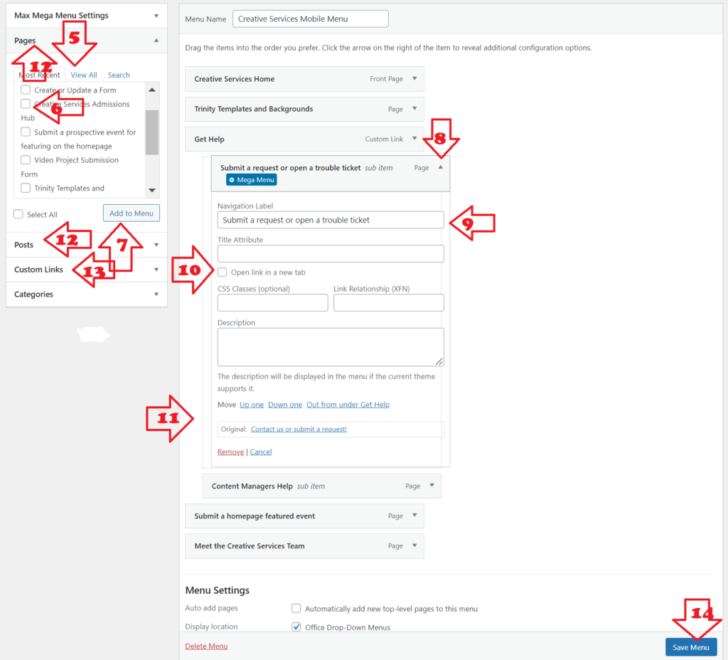
5. Find a PUBLISHED PAGE (or post) to add to the menu. You can select from “Most Recent,” if you just created the page, or sort through all your posts/pages in “View All,” or use “Search” If you know your post/page’s title, but it is not recently created.
6. Click the checkbox next to the page you want to add.
7. Click “Add to Menu” to add to the bottom of the menu.
8. Expand (or contract when you are done) the menu item options module with the arrow.
9. Customize the text that users will see — default is the page’s title, but if the page title is not what you want people to see when they are looking for it, you can customize this text.
10. Only use “Open Link in New Tab,” if you are using Custom links (see below).
11. Drag and drop the menu item module where you want it to appear in the menu. To make it appear nested under an UNLINKED subheading, drop it in with an indent under the subheading. (see dotted line box for an example of what this will look like when you are doing it correctly). Never place a link nested under another link, this will create frustration for visitors when they go to expand the submenu but it reloads their window instead. Use UNLINKED subheadings instead when nesting (see below).
12. Selecting from “Posts” works just like selecting from “Pages.”
13. Custom Links: If you are linking to content that is not housed on your department/office subsite, use custom links AND CHECK THE “Open Link in New Tab” option (10.) to make sure visitors can return to your site. Custom links are also used to create UNLINKED SUBHEADINGS (see below).
14. Save Menu: Your changes will be lost and we cannot get them back for you if you navigate away without hitting this button to commit your changes. There are no draft or revisions feature in menu.
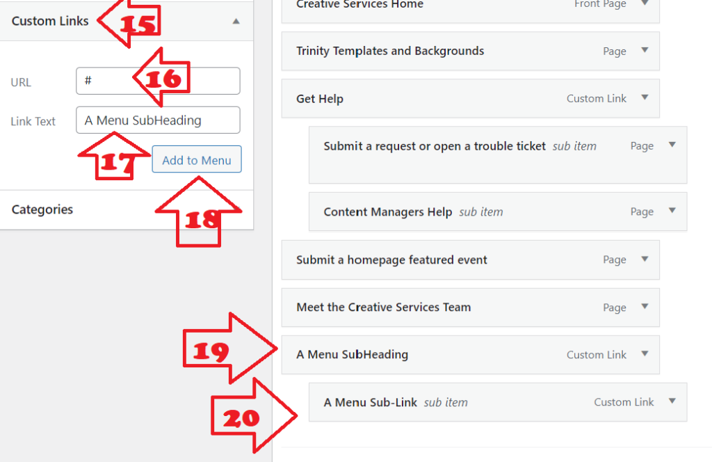
To Create a Menu Subheading:
15. Use “Add Custom Link” to create an UNLINKED Menu Subheading.
16. In the URL field type “#”.
17. In “Link Text” field, type what you want the subheading to say.
18. Click “Add to Menu” to add new subheading to the bottom of the menu.
19. Drag the UNLINKED subheading to where you want it to appear in the menu.
20. Nest all links that belong under the subheading by dragging them under the subheading and using indent to nest.
Getting started with Pages
To kick off adding a new page, click on “Pages” in the left dashboard nav, and click “New Page” to initiate.

Begin with giving your new page a title. Be sure to spell everything correctly before you save the draft.
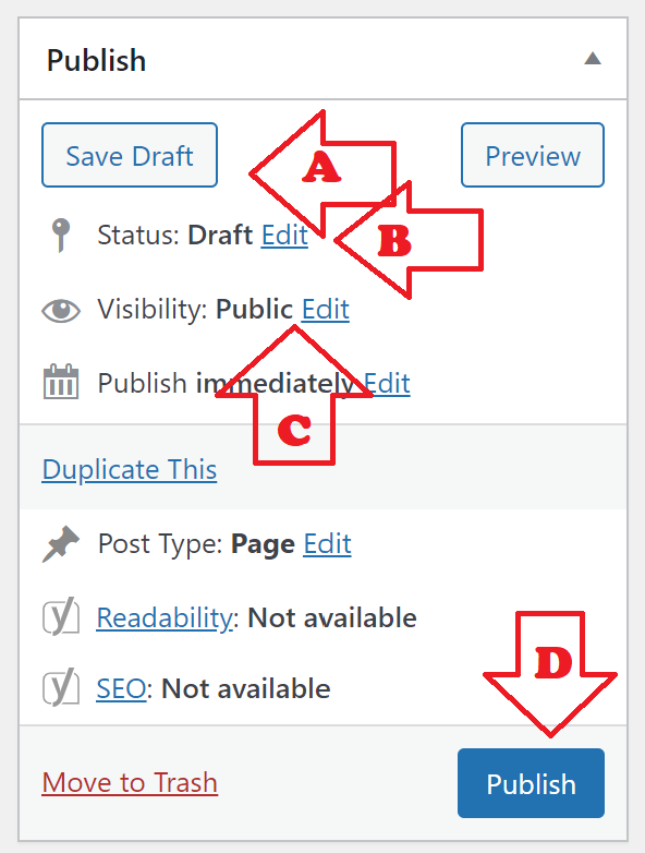
A. Save your drafts to continue working on a draft page without making your changes public.
B. See and manage the publish status of your page: Draft or Published.
C. Visibility of a published page can be Public, Private (only logged in Trinity WordPress users can see), or Password Protected (you create a password to view — DON’T FORGET WHAT YOU CHOSE!).
D. When you’re ready for your draft page to be seen by the world, click “Publish.” This button will change once the page is published.
E. WPBakery Backend Editor Selection Button: More advanced editing tools for a more experienced content editor. See the Advanced content editing section of this tutorial for more.
F. WPBakery Frontend Editor Selection Button: Takes you to the frontend page editor, where you can add and move editors and see what they’ll look like on your page in real time. Use this if you are new to content management.

Your page will be built of elements. Elements are the different types of content on a page: Heading, Text block, Image, etc.
G. Add Element Button: This will allow you to add new elements to your page. Use the big one on the page to get started. After you add your first element, this will disappear, but you can still add more elements by using the plus sign at the top of the editor window.
H. Save Draft Button, just like on backend.
I. Publish Button, just like on backend.
J. Preview layout: Preview the layout on different screen sizes to make sure it will look exactly as you intend for any user.
K. Backend Editor button: Takes you back to the backend editor for more advanced page layout options (for more advanced content managers).
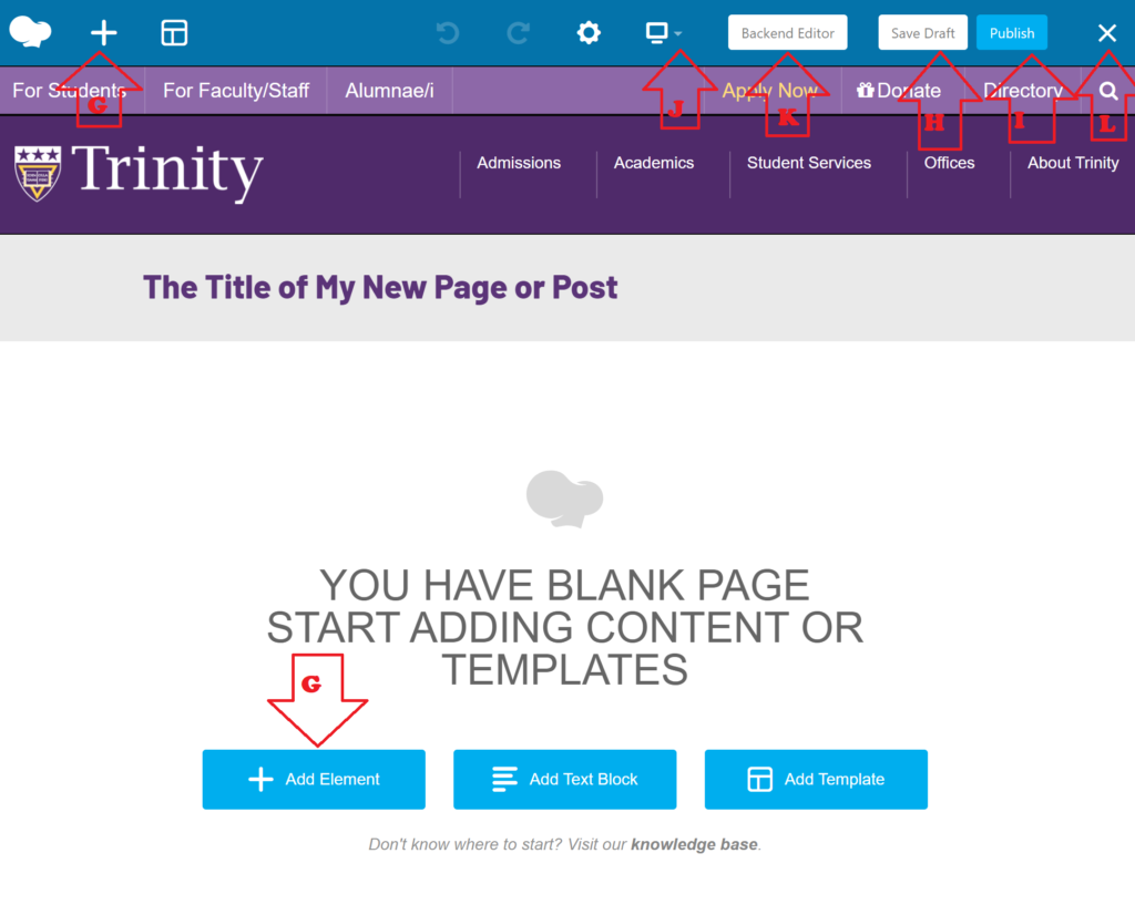
L. Exit WPBakery Edit mode: When you’re done with your changes and YOU’VE SAVED YOUR DRAFT, PUBLISHED OR HIT UPDATE, you can exit here. But you will lose your changes if you hit the X without saving, just like in any publishing software.
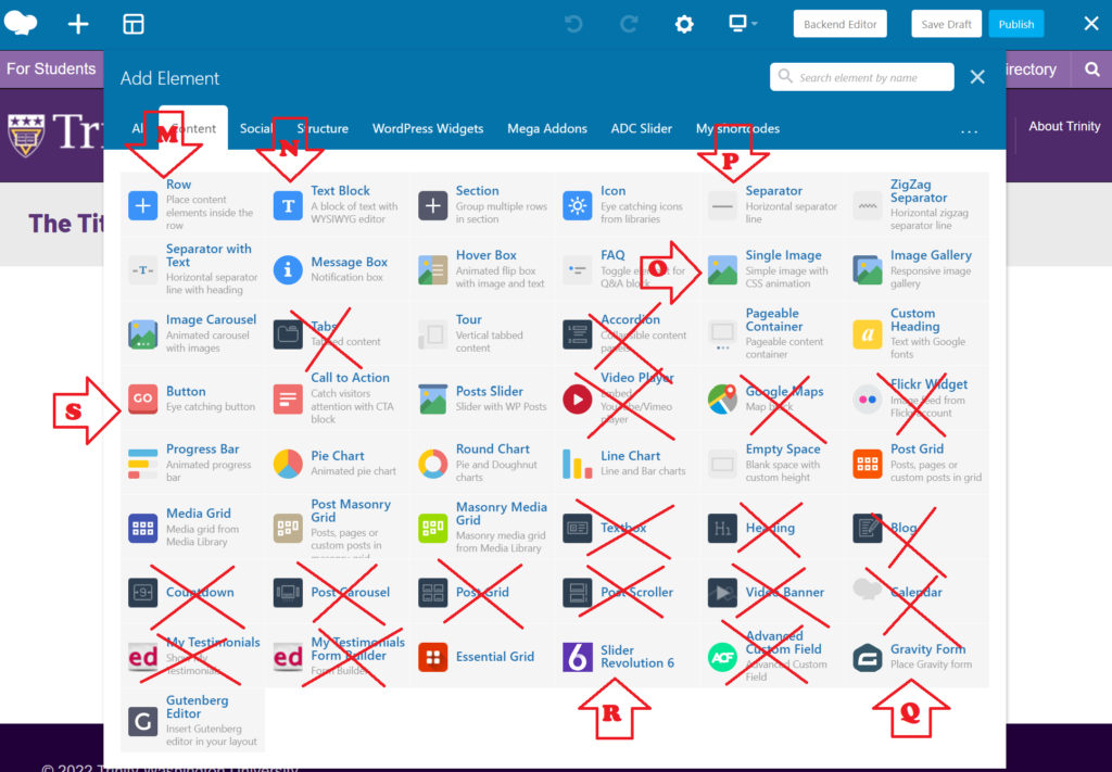
P. Add a Separator: Adds a padded horizontal line to the row column to separate elements visually. Best used in single column rows to separate different sections of the page.
Q. Add a Gravity Form: Adds AN EXISTING Gravity Form to a row column. The form must already have been created and published BEFORE trying to add. To have a new form created for your site, use the Creative Services “Submit a Request” form and follow the prompts to enter the details of your new form.
R. Add a Revolution Slider: Adds AN EXISTING Revolution Slider to a row column. The slider must already have been created and published BEFORE trying to add. To have a new Slider created for your site, use the Creative Services “Submit a Request” form and follow the prompts to enter the details of your new slider.
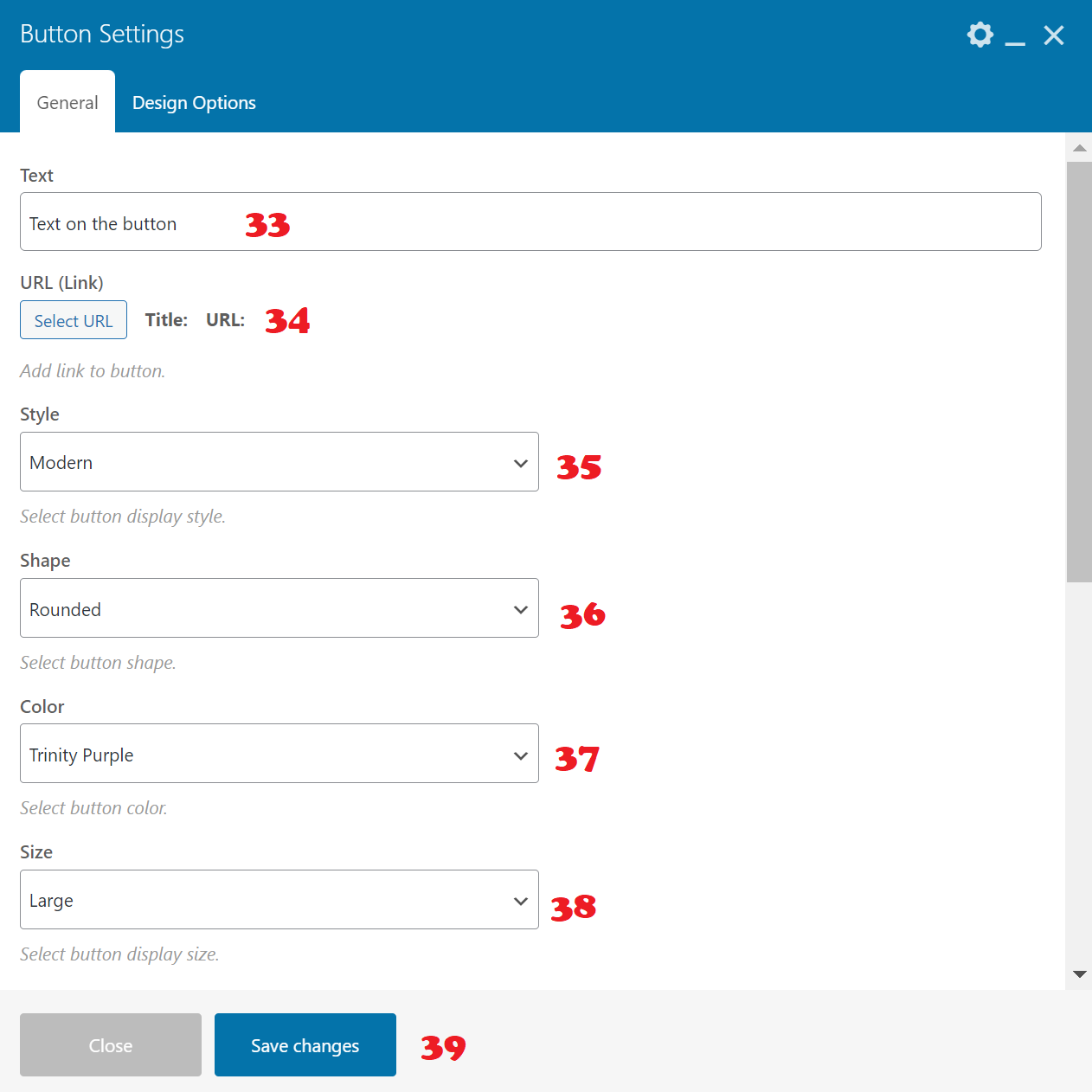
S. Add a Button: Adds a responsive, mobile friendly clickable button to a row column with advanced features. For more on adding a button, click here.
M. Add Row: A row contains other elements and — most importantly — can be divided into columns that different elements can be placed in side by side. A row is the basic element other elements go into. Rows can even be nested 1 deep — meaning you can put a row INSIDE a row. But you cannot nest deeper than that, meaning you cannot put a row inside of a row inside of a row. This is helpful if you want more advanced columns — you can create a two column row, and within one of those columns you can place another row with three columns. Elements within rows (and row columns) are stackable, so you can put a textbox right under an image in the same column, and keep stacking infinitely. For more on managing a row in WPBakery, click here.
N. Add Text Block: Adding a text box will place an editable module in a row column that uses the Classic WordPress WYSIWYG editor. See the separate tutorial on the Classic WordPress WYSIWYG editor for more on this. For more on editing a text block, click here.
O. Add a Single Image Block: Adds a single responsive, mobile friendly image block to the row column with advanced features. For more on using the single image editor, click here.
Managing a new row.
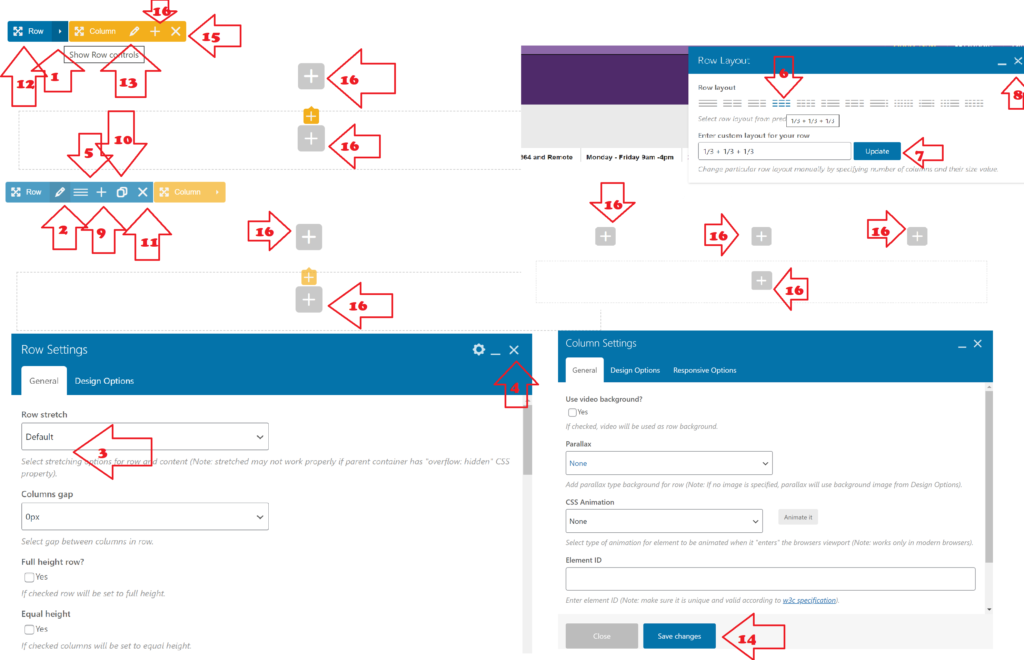
1. Show row controls: Expands the row context menu to give you access to manage the row.
2. Edit row settings: Opens row settings module to make basic customizations to row.
3. Row stretch: “Default” gives you a regular size row with lots of padding on the right and left, with content that fills the row, “Stretch Row” stretches the row itself all the way to the far right and far left of the screen, but leaves the content stretch at default, centered in the row, “Stretch row and content” stretches the row to the far left and far right of the screen, as well as pushes content all the way to the edges, “Stretch row and content (no paddings)” will ignore all padding at the edges of the row — NOT FOR ROWS CONTAINING TEXT ELEMENTS EVER!
For any of these other more advanced settings in row settings, please contact Creative Services at creative@trinitydc.edu.
4. Close row settings module.
5. Change Layout: Opens “Row Layout” module, to change the number of columns next to one another in the row.
6. Select the column setup you prefer.
7. Click update.
8. Exit row layout module.
9. Add new column: DOES NOT PLACE COLUMN NEXT TO OTHER COLUMNS. Will add another + BELOW current row content. Not entirely useful.
10. Duplicate row: Copies the current layout of the row AND all current content into a new row below.
11. Delete row: Deletes the entire row, all columns in it, and all content in all columns. BE CAREFUL WITH THIS ONE!
12. Move row: Move row around on page, place above or below another row.
13. Edit column settings: Opens column settings module to make basic customizations to column. ONLY FOR ADVANCED USERS.
14. Save Changes: (similar for Row settings module, must be pressed to commit all changes).
15. Delete column: DO NOT USE UNLESS YOU KNOW WHAT YOU ARE DOING! Will not readjust columns, will just create a space where the column used to be.
16. Add element: Adds a new element (text block, image block, separator, etc.) into a row column.
Managing a new text block.
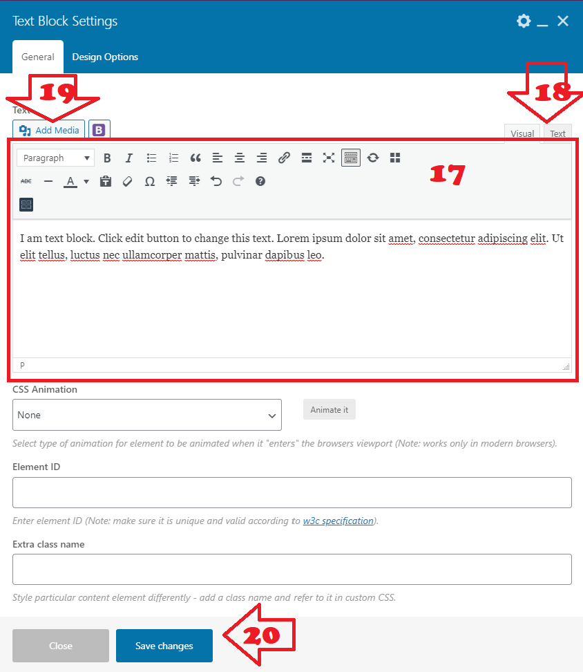
17. WordPress Classic Text Editor: See our separate tutorial on using this editor.
18. Visual editor/HTML text editor toggle: If you have a firm grasp of HTML code, you can edit this block’s content in HTML using the text editor tab. Otherwise, you may want to stay in the visual editor.
19. Add Media: DEPRECIATED! PLEASE DO NOT USE THIS! Use the image block element in WPBakery instead. JUST put TEXT ONLY in this block. No images.
20. Save changes: All changes will be lost if you navigate out of this module without committing your changes first with this button.
Managing a new single image block.
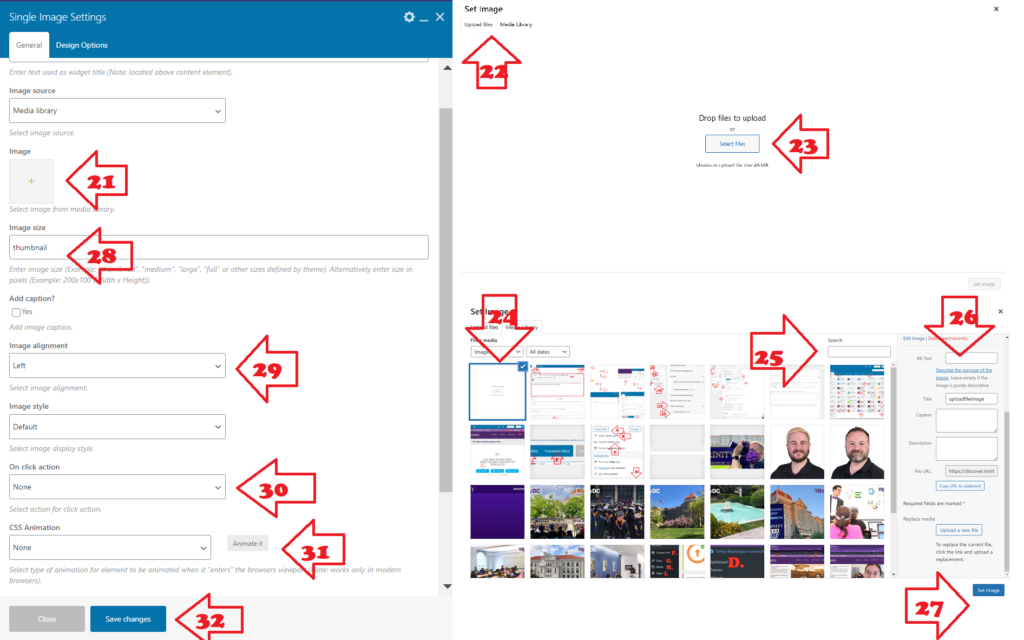
21. Select image from media library: opens the media library manager as a module to allow to either upload a new image or select an existing library image.
22. TO UPLOAD AN IMAGE, select the “upload file” tab, otherwise stay on “Media library” tab and skip to 24.
23. Click “select files” to select from a folder on your computer, OR you can just drag and drop into this area.
24. Make sure the image you want is checked.
25. If you need to, you can search for an image in your library. This tool searched the file name, alt text, and entered description of an image, so it’s best if you always add alt text for this reason, as well as accessibility issues.
26. Alt text: MUST FILL OUT — this field MUST be filled out for the visually impaired using screen readers. Also helps with the search feature for you. Every image needs alt text.
27. Set Image: will finalize image selection.
28. Image size: usually “large” is the best thing to put here. This will fill the entire element block.
29. Image alignment: left, right or center.
30. On click action: GENERALLY ALWAYS SET TO “NONE.” NEVER USE “LINK TO LARGE IMAGE.” Use “Open custom link,” to link out from an image to some content on another page.
31. CSS Animation: IF we use animation, we generally use “FlipInX.”
32. Save changes: MUST CLICK to commit changes.
Getting started with Posts
To kick off adding a new post, click on “Posts,” “News,” “Hub Posts,” “Newsletter Stories,” “Class Notes,” or “Memorials,” in the left dashboard nav, and click “New Post” or “New Item” to initiate. From here out, we will use the word “post” to refer to all of these.

Begin with giving your new post a title. Be sure to spell everything correctly before you save the draft.

A. Save your drafts to continue working on a draft post without making your changes public.
B. See and manage the publish status of your post: Draft or Published.
C. Visibility of a published post can be Public, Private (only logged in Trinity WordPress users can see), or Password Protected (you create a password to view — DON’T FORGET WHAT YOU CHOSE!).
D. When you’re ready for your draft post to be seen by the world, click “Publish.” This button will change once the page is published.
For more on editing your post, see our “Classic Editor” tutorial.
Using the WordPress Classic Editor
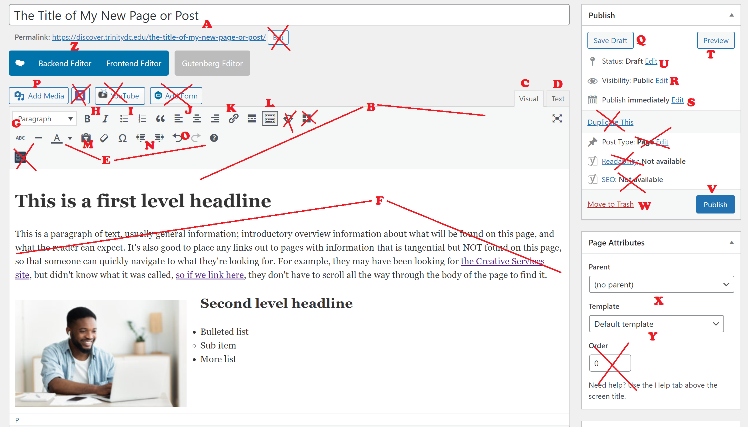
A. Title field: be mindful of spelling and grammar, the URL is automatically generated from this, and it is not our policy to edit URLs very often because of the linking and SEO problems it causes, so get it right from the start please!
B. WordPress WYSIWYG (“What-You-See-Is-What-You-Get”) editor module: this includes the large editor field, toolbar, editing view tabs, and add media button.
C. Visual editor view tab: edit the page like you would edit a Microsoft Word or other word processor document.
D. Text editor view tab: edit in HTML only. DO NOT USE IF YOU’VE NEVER BEEN TRAINED ON HTML. If you load the page and see only HTML code in this window, you can switch back to the visual editor view easily by hitting that tab. Sometimes this happens.
E. WYSIWYG editor toolbar: All the buttons WordPress provides to format your content.
F. WYSIWYG editor large editor field: The space where you actually compose your content. Works very much like a basic word processor.
G. Text formatting selector: Choices are top level headline, secondary headline, tertiary headline, 4th level headline, 5th level headline, 6th level headline and paragraph. You will use Heading 1, Heading 2, Heading 3 and paragraph formatted text most often.
H. Toggle bold & italics formatting on and off.
I. Toggle bulleted lists or numbered lists on and off: The best way to create a formatted list, is to type each item in the list out on its own line, just in paragraph formatting, highlighting everything that needs to be included, and then clicking either the bulleted list or numbered list button. You can also remove list formatting by highlighting a list and clicking the button, to return the content to paragraph formatting.
J. Text alignment selectors.
K. Hyperlink button: Highlight some text and click this button to open the hyperlink context menu (see more on linking text below).
L. Kitchen Sink toggle: IF YOU SEE ONLY THE FIRST ROW OF BUTTONS, hit this button to reveal the second and third row of buttons.
M. Paste without formatting/clear formatting toggle buttons: The clipboard icon allows you to paste text in from Word or Outlook and remove all the weird and wacky formatting that might come with it. The eraser icon does the same thing but after-the-fact. If you paste something in and it looks very strange because of Word or Outlook formatting, you can highlight all of the text with the weird formatting, and click this button to remove it. This button WILL remove bold, italics, heading formatting, list formatting, and hyperlinks, though, so keep that in mind.
N. Increase/decrease indent buttons: When working on lists, you can create sub-levels within the list by increasing the indent. You can get out of that sublevel by hitting the decrease indent button.
O. Undo changes, redo changes button.
P. Add media button (see more below). If you are editing in the WPBakery Frontend Editor or WPBakery Backend editor DO NOT USE THIS BUTTON. See this tutorial instead.
Q. Save draft button: When creating a new page you can save your changes and move away without publishing by hitting this button. HOWEVER, once a page is published, do not use this button anymore. Hitting this button will take the page OUT of the published state and back into the offline state.
R. Visibility options: Public (the whole world can see it once its published), Private (only people logged into Trinity’s WordPress system — which means they need to already have access to the system, which is very few people), & Password protected (does not use the Trinity login system, but you must remember the password, or we will have to delete the page and start over from scratch).
S. Publish timing: Publish immediately (publishes as soon as you hit the publish button), Schedule to publish on a specific date and time, or backdate.
T. Preview: Preview your page before committing your changes.
U. Page published status: Draft, pending review, or published.
V. Publish button/update button: When you’re ready to make your draft page go live, hit this button to publish. Once it is published, this button will change to “Update,” and you have to hit this button to commit your changes if working on an already published page.
W. Move to trash: If a page is no longer needed, and is not linked to from anywhere, please take the trash out to keep the clutter down, and keep your organization
X. Parent page selector: IF this is the child page under a major page, then you can make this designation here. If you don’t know what you’re doing here, don’t touch this.
Y. Default template: The only templates we use are default and Front Page. And Front Page is only for front pages.
Z. Toggle editor: This view is the Classic Editor, you can also switch to the Backend editor and frontend editor from here. MAKE SURE TO SAVE YOUR WORK BEFORE YOU CLICK ONE OF THESE!
Hyperlink Context Menu

AA. To access the link context menu for an existing link, click the linked text once.
AB. Click the “pencil” icon to continue editing.
AC. Click the “broken chain” icon to remove the link, but leave the text.

AD. Simple URL quick editor: to quickly edit an existing URL, or add a fresh URL to text you’ve just highlighted and hit the “link” button in the toolbar for, you can click in this area and edit the text of the URL here.
AE. Click the “gear” icon for more robust URL editing options (see below).
AF. Click the “carriage return” arrow button to commit all changes.
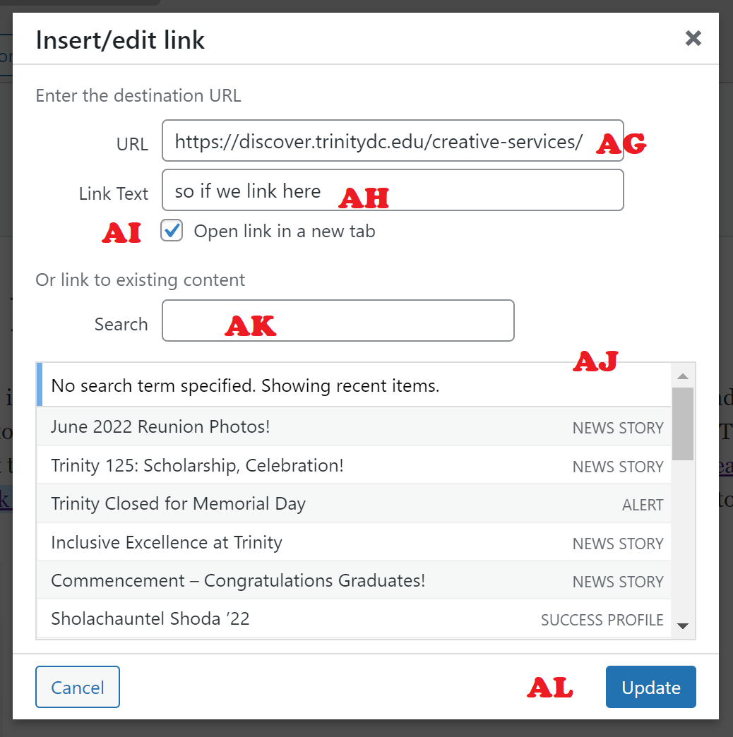
AG: URL text editor: input the text of the URL here.
AH: Link text editor: You can edit the hyperlink’s text without breaking or changing the link at all. For example, if linking to a page and using the page title as the link text — if the page title changes on the linked to page, you can edit the link text here to update it to the new page title, without messing with the hyperlink URL itself.
AI: “Open Link In a New Tab” checkbox: If you are linking within your own subsite/office site, then leave this unchecked. If you are linking to another Trinity office’s site, the main Trinity page, or outside of the Trinity website altogether, check this box so users can easily find their way back to your site if they click a link away.
AJ: Choose to quickly and easily link to recent PUBLISHED, PUBLIC pages and posts on your office site/subsite.
AK: Search through all your office site/subsite’s PUBLISHED, PUBLIC pages and posts to quickly link, without having to know the URL.
AL: Update: Commit your changes.
Adding Media/Images
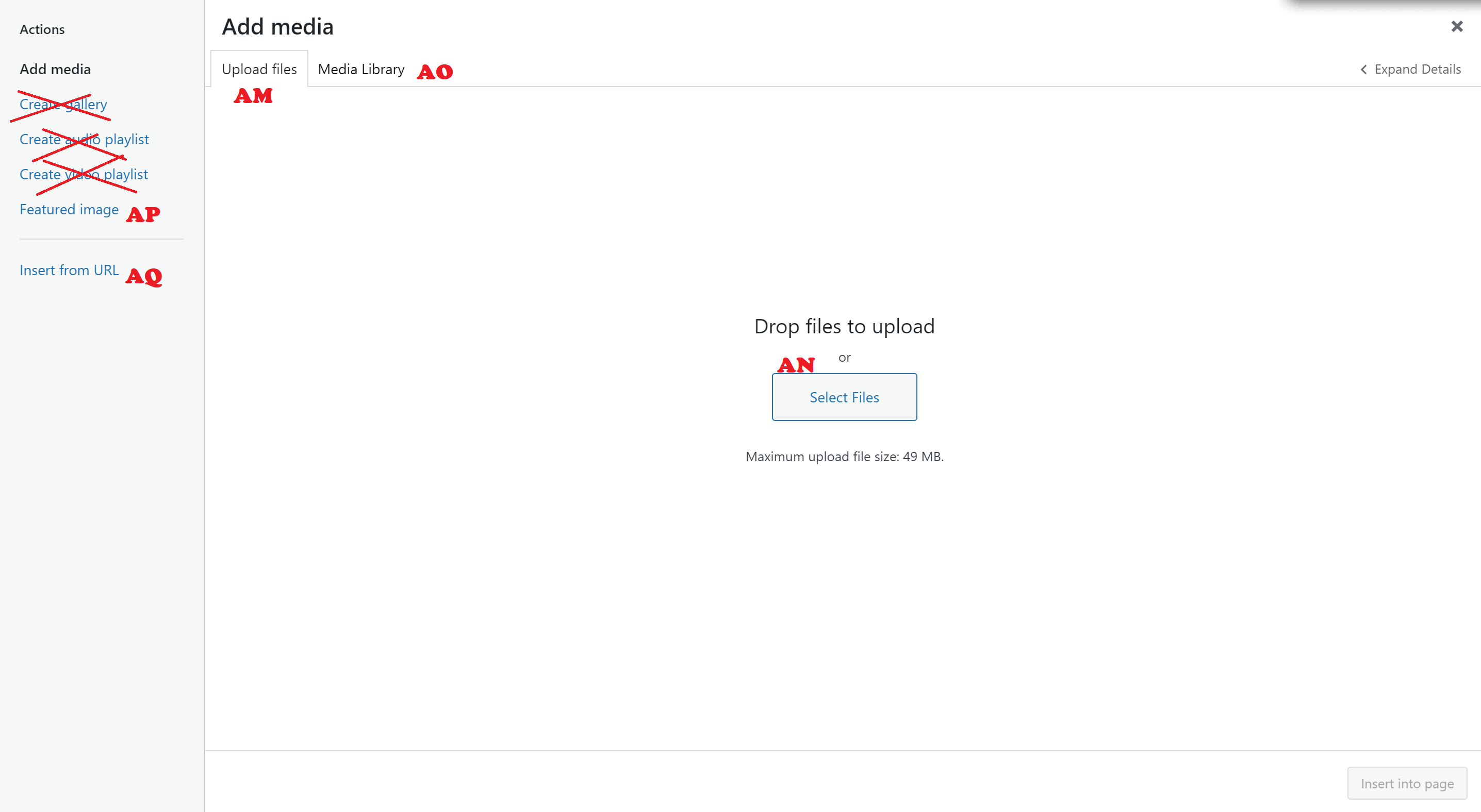
AM. If you are editing in the WPBakery Frontend Editor or WPBakery Backend editor DO NOT USE THIS BUTTON. See this tutorial instead. When you click on the “Add Media” button, you can select the “Upload media” tab to be taken to the view to upload a new image, IF the image does not exist in your Media Library already. PLEASE DO NOT DOUBLE UPLOAD IMAGES! We do not have unlimited space on our servers. The more times you upload the same image, the fewer images we’ll have space for in the future!
AN. Drag & drop the image you’d like to upload here, or click the large “Select Files” button.
AO. If the image already exists in your Media Library, you can access you full media library in this tab.
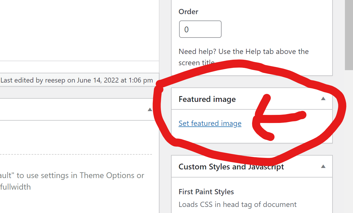
AP. Set a featured image for your page or post: important if you expect this page or post to be shared on social media! This won’t appear anywhere on your page or post, but it will be the image that comes up when sharing the page on Facebook, Twitter, LinkedIn, etc. It’s also the image Google Search will associate with the page.
AQ. Insert from URL: if the image already exists somewhere else on the public web, and you just want to link to that picture, you can insert from the URL of that picture here. This will save space on our server!
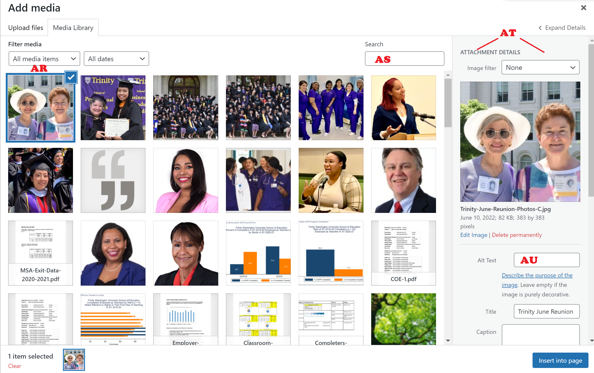
AR. When an image is selected to be placed in the page, it will be highlighted in blue with a blue check in the upper right corner, this also opens up that image’s attachment details sidebar.
AS. If you are diligent about naming your images and writing alt tags for them smartly, search can be helpful here. If all your images are just titled “IMG 1234.JPG,” and have no alt tags, then search won’t do much good here.
AT. Image attachment details sidebar: VERY IMPORTANT, before you place your image, make sure you’ve checked that there is an alt tag, that you’ve selected the right alignment, that link to is set correctly, and that you have a useable size (see below).
AU. Alt Tag field: MANDATORY! Any user visiting with a screen reader that cannot see the image, will need the alt tag to be helpful enough to get all information from image needed. Most images need only a few words in the alt tag (“dog playing with ball near pond”). However, if your image has words in it, then you need to type the text into this alt tag field so that visually impaired visitors can receive the same information that our seeing visitors can receive.
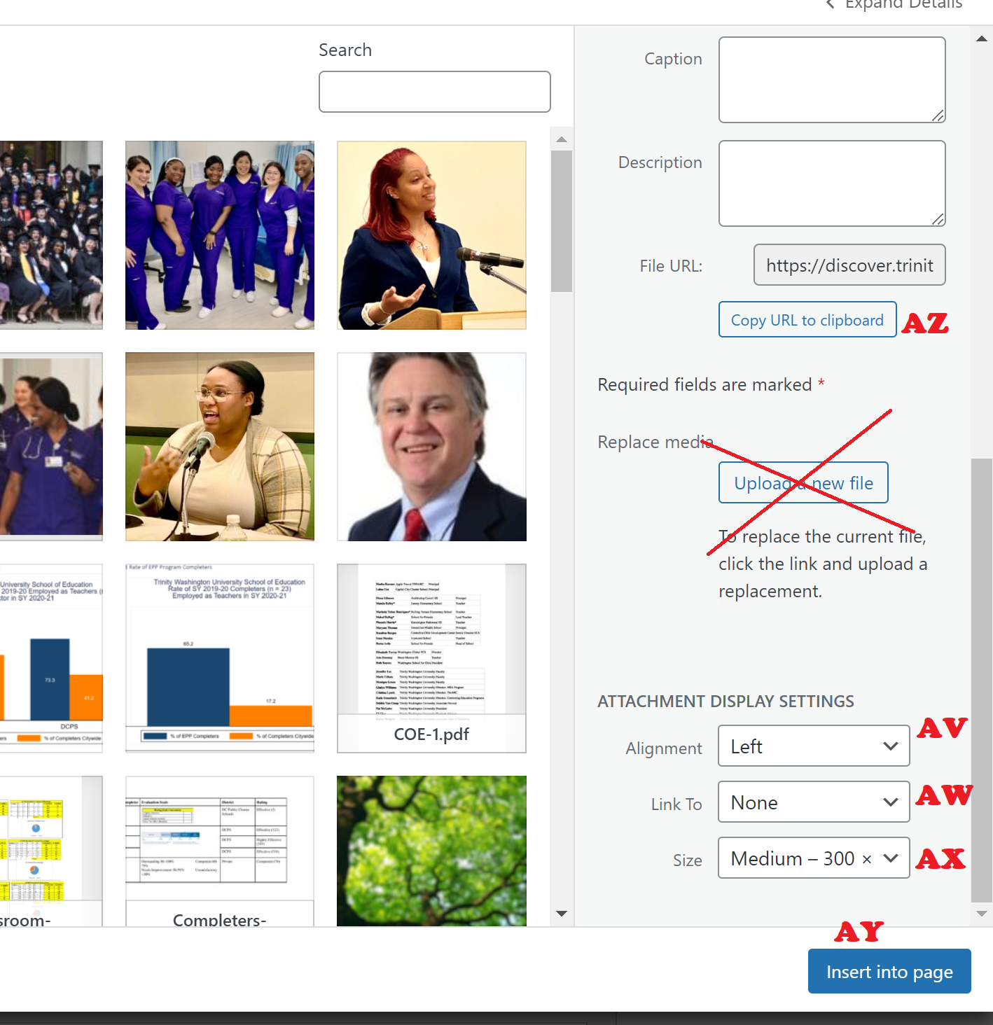
AV. Alignment: always choose “left,” “center,” or “right.” Never choose none.
AW. Link to: always choose “none,” or “custom URL,” IF you know what you’re doing for custom URL. Never choose “Media File,” or “Attachment Page.”
AX. Size: this can be tricky. Best to stick with “large,” or “medium.” This can be adjusted later.
AY. Insert image into page: This commits all your changes.
AZ. Copy image URL: If you need to go find a URL to an image in your library, you can find it here!
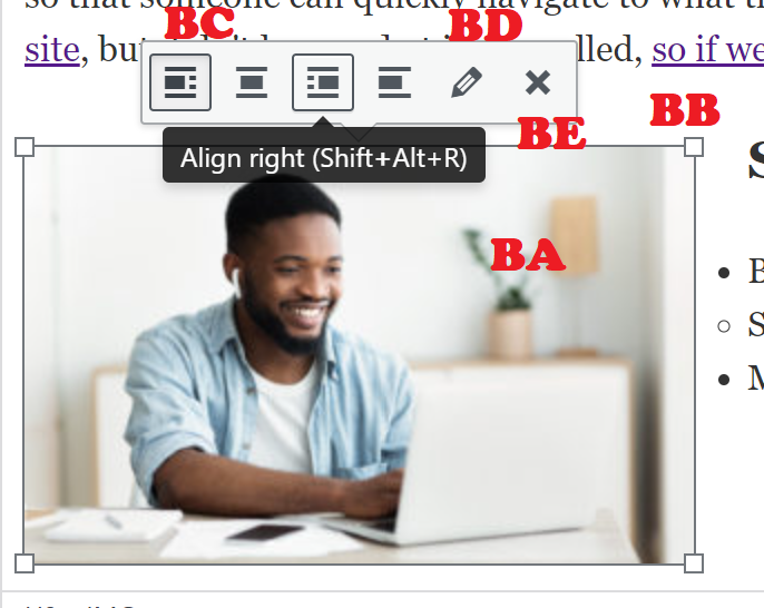
BA. If you place an image, and you aren’t fully happy with how it looks, or you think it needs some small tweaks, you can access a special image context menu by clicking right on the image once.
BB. You can diagonally scale adjust the image to make it slightly bigger or slightly smaller, by clicking and dragging the white squares in the corner. The image will scale adjust in the direction of the corner square you click and drag.
BC. You can switch the alignment of the image using the first four buttons: align it left, center, right or none (never use none, though).
BD. Use the pencil icon to access even more options (see below).
BE. Remove the image entirely by clicking this “X.”
You can also set your “Featured Image” for search engine crawlers, and social media shares here in the right sidebar.
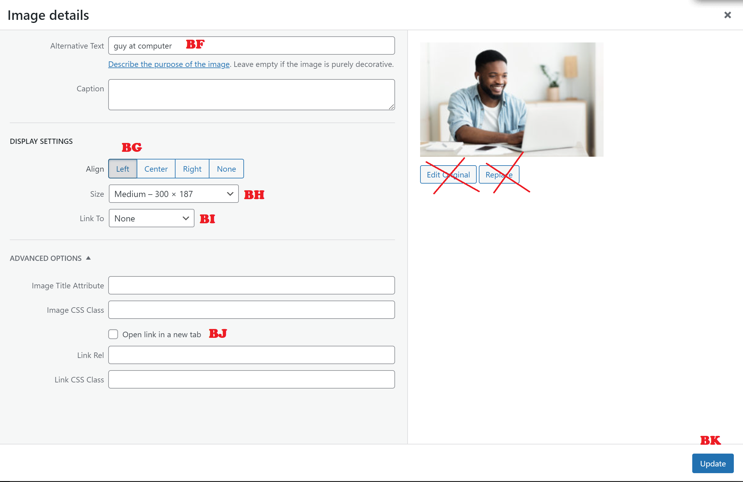
Once in the pencil menu, you can see a lot more options for adjusting the image.
BF. Alt text: Again, always set the alt text.
BG. Algin image.
BH. pick from sizes, or choose “custom size” if you know what dimensions you want.
BI. Choose link to “none” or “custom URL.”
BJ. If you use a custom URL, and you are linking away from your office site/sub-site, then use “Open Link In New Tab,” so users can easily get back to your site after they link away.
BK. Update: Commit your changes.
Special fields for “posts,” “news stories,” or “blogs.”
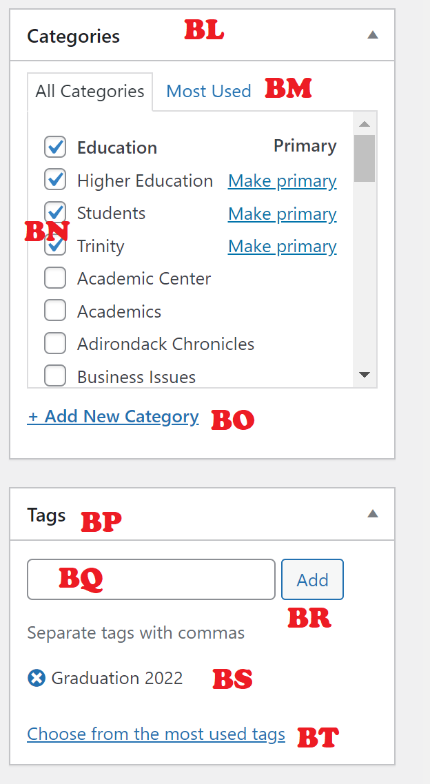
For Posts only, not pages, you have three additional fields to attend to: Categories, Tags, & Excerpt.
BL. Select your post’s categories it can be filed with. You can select more than one category.
BM. If you have a LOT of categories on your subsite, you can switch between the tabs for “All Categories,” and “Most Used Categories.”
BN. Use the checkmarks next to the category name to select. Your changes will not be committed until you publish or update the post, or save the draft.
BO. FOR ADVANCED USERS ONLY: You can add a new category if you know what you are doing. Otherwise, please stick to the existing categories, and reach out to Creative Services if you feel that they are not sufficient.
BP. Tags: You can add as many tags as you want to a post to help make it more searchable on the site.
BQ. Tag entry field: Start typing your tag here. If you wait a few moments, WordPress may suggest existing tags based on the first few letters you type. So, if you are pretty sure you have a tag for “Graduation” you can start typing “Grad” and wait for the suggestions, and see that you have a “Graduation 2022” tag already. Click on it, to add it to the field. Then type as many tags as you want, just separate by comma. Your tag names cannot have commas in them, or else your tag will be interpreted as multiple tags.
BR. Click add to populate your list in the tag list below. This will also add any new tags you’ve typed into the tag database.
BS. If a tag has been added in error to this list, you can click the blue circled-x next to the tag to delete it.
BT. You can also view a list of the most used tags on the subsite to select from those.

BU. Excerpt field: Summarize your post in one-to-two short sentences — NO MORE THAN THAT — to give potential readers a teaser of what they can find if they click on the article title.
Getting started with Pages
To kick off adding a new page, click on “Pages” in the left dashboard nav, and click “New Page” to initiate.

Begin with giving your new page a title. Be sure to spell everything correctly before you save the draft.

A. Save your drafts to continue working on a draft page without making your changes public.
B. See and manage the publish status of your page: Draft or Published.
C. Visibility of a published page can be Public, Private (only logged in Trinity WordPress users can see), or Password Protected (you create a password to view — DON’T FORGET WHAT YOU CHOSE!).
D. When you’re ready for your draft page to be seen by the world, click “Publish.” This button will change once the page is published.
E. WPBakery Backend Editor Selection Button: More advanced editing tools for a more experienced content editor. See the Advanced content editing section of this tutorial for more.
F. WPBakery Frontend Editor Selection Button: Takes you to the frontend page editor, where you can add and move editors and see what they’ll look like on your page in real time. Use this if you are new to content management.

Your page will be built of elements. Elements are the different types of content on a page: Heading, Text block, Image, etc.
G. Add Element Button: This will allow you to add new elements to your page. Use the big one on the page to get started. After you add your first element, this will disappear, but you can still add more elements by using the plus sign at the top of the editor window.
H. Save Draft Button, just like on backend.
I. Publish Button, just like on backend.
J. Preview layout: Preview the layout on different screen sizes to make sure it will look exactly as you intend for any user.
K. Backend Editor button: Takes you back to the backend editor for more advanced page layout options (for more advanced content managers).

L. Exit WPBakery Edit mode: When you’re done with your changes and YOU’VE SAVED YOUR DRAFT, PUBLISHED OR HIT UPDATE, you can exit here. But you will lose your changes if you hit the X without saving, just like in any publishing software.

P. Add a Separator: Adds a padded horizontal line to the row column to separate elements visually. Best used in single column rows to separate different sections of the page.
Q. Add a Gravity Form: Adds AN EXISTING Gravity Form to a row column. The form must already have been created and published BEFORE trying to add. To have a new form created for your site, use the Creative Services “Submit a Request” form and follow the prompts to enter the details of your new form.
R. Add a Revolution Slider: Adds AN EXISTING Revolution Slider to a row column. The slider must already have been created and published BEFORE trying to add. To have a new Slider created for your site, use the Creative Services “Submit a Request” form and follow the prompts to enter the details of your new slider.
S. Add a Button: Adds a responsive, mobile friendly clickable button to a row column with advanced features. For more on adding a button, click here.
M. Add Row: A row contains other elements and — most importantly — can be divided into columns that different elements can be placed in side by side. A row is the basic element other elements go into. Rows can even be nested 1 deep — meaning you can put a row INSIDE a row. But you cannot nest deeper than that, meaning you cannot put a row inside of a row inside of a row. This is helpful if you want more advanced columns — you can create a two column row, and within one of those columns you can place another row with three columns. Elements within rows (and row columns) are stackable, so you can put a textbox right under an image in the same column, and keep stacking infinitely. For more on managing a row in WPBakery, click here.
N. Add Text Block: Adding a text box will place an editable module in a row column that uses the Classic WordPress WYSIWYG editor. See the separate tutorial on the Classic WordPress WYSIWYG editor for more on this. For more on editing a text block, click here.
O. Add a Single Image Block: Adds a single responsive, mobile friendly image block to the row column with advanced features. For more on using the single image editor, click here.
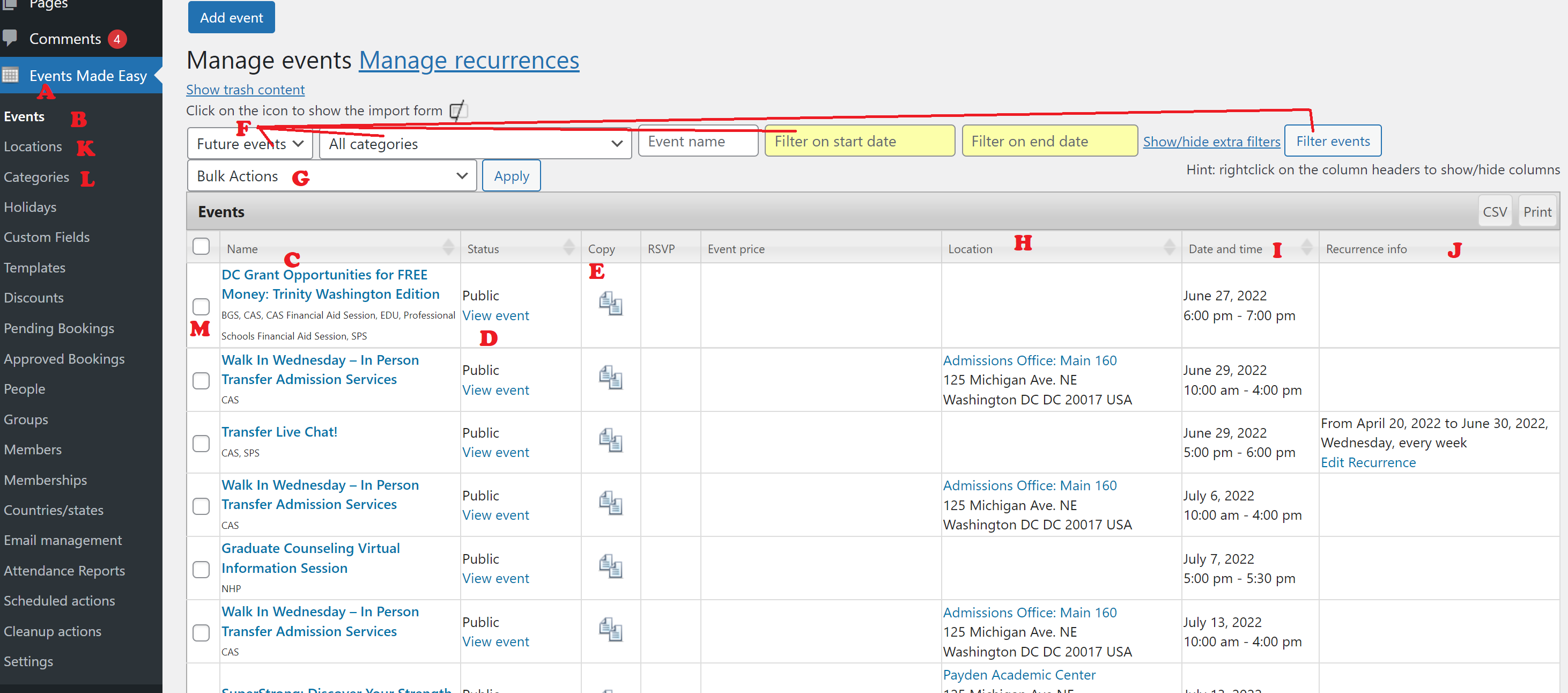
A. Events Made Easy Nav Tab: Start here!
B. Events sub menu: Access options for events here.
C. Single Event Title: Links to the edit page.
D. View Event: If the event is public, you can see it like your public will see it.
E. Copy Event: Copy an event if a new event will have most of the same details as an old event. NOTE: it will copy over the old start and end dates as well. ALL details are copied over, so updates will need to be made. This is DIFFERENT than creating a recurrence. You can create a recurrence within the edit event view.
F. Sort Events List: You can sort the list of events by future or past events, by category, you can limit the dates of events shown in your list, and hit “Filter Events,” when you’ve set the parameters on your filter you need.
G. Bulk actions: use the checkboxes (M) to select multiple events, and then apply a bulk action to all (hit “apply” button to commit.
H. Sort list by location.
I. Sort list by date/time.
J. Sort list by whether or not it is a recurring (happening more than once) event.
K. Locations items: Add or edit different locations that will appear in your list of available locations to choose from.
L. Categories items: Add or edit the categories that the events can be applied to. PLEASE CONSULT WITH CREATIVE SERVICES FIRST.
M. Checkboxes for bulk editing.
Event Editing View
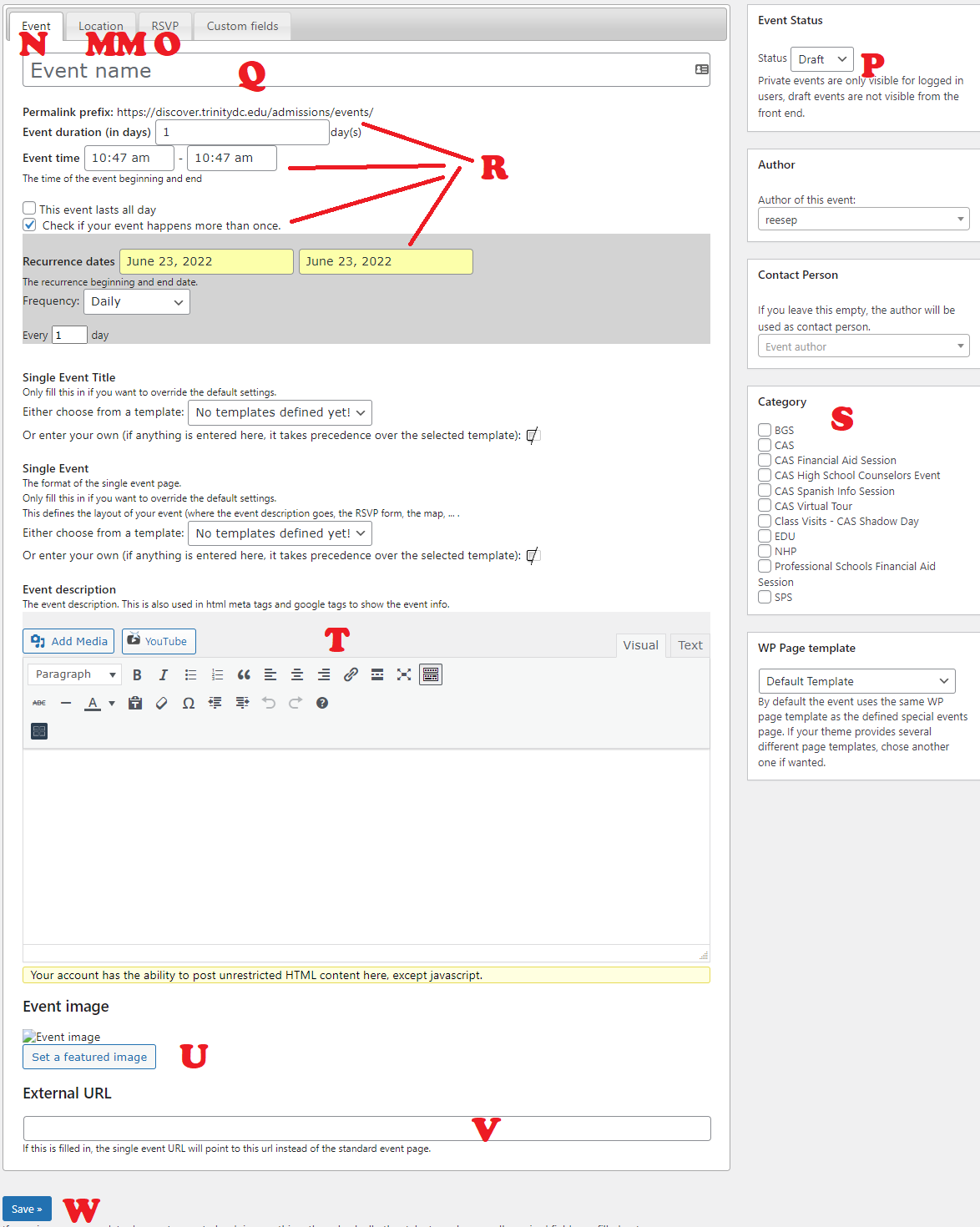
N. Events editing tab: all the main events information can be edited here, other than Location or RSVP.
MM. Locations editing tab: See below.
O. RSVP editing tab: See below.
P. Event Status: Default is draft, MUST BE CHANGED TO PUBLISHED BEFORE YOU CLICK SAVE in order for event to be public. If you create an event and it’s not showing up, check that you’ve done this before you contact Creative Services.
Q. Event Name: What is the name of your event? There may be special words you have to include that Creative Services has given to you to make sure your event acts in certain ways (for example, Admissions online events must include the word “webinar” in their title, in order for the zoom link to appear in the RSVP). Check your specific notes from Creative Services to be sure.
R. Date and time settings: See below.
S. Category: This usually determines WHERE your event will show up on the website. Double check with your notes from Creative Services about your specific site.
T. Event details editor: See the Classic Editor tutorial for a full overview of this editor.
U. Set featured image: THIS DOES NOT PLACE AN IMAGE IN YOUR EVENT DETAILS, this will set the image that will show up on social media when this event is shared.
V. External URL: THIS IS NOT HOW YOU PUT LINKS INTO THE EVENT DETAILS. What this does is turn this event listing into a link to another page. When someone clicks on the event title in a list of events, instead of being taken to the event details, they will be taken to whatever URL is in this field. DO NOT USE THIS IF YOU DON’T KNOW WHAT YOU ARE DOING. This is best used for co-sponsored events, where one of the sponsors will host the main details/RSVP form, or events that appear on multiple subsites, or events whose details are hosted on another website.
W. Save: Your details will be lost if you don’t click save before navigating away.
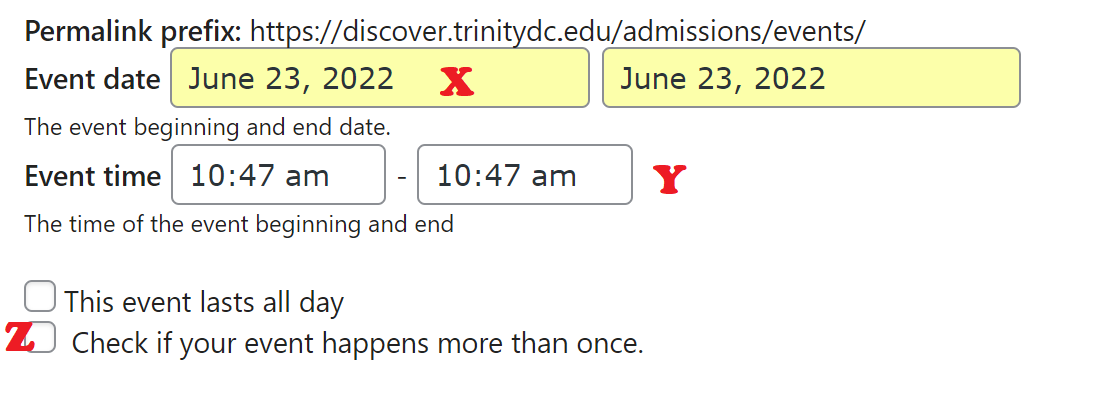
X. The start date and end date of your SINGLE event listing. Generally this will be the same day, with a few exceptions, such as listing a holiday weekend, etc.
Y. The start time and end time of your event.
Z. Checkboxes: This event lasts all day (removes start and end time), This is a recurring event (sets the event as happening in a pattern, see below).
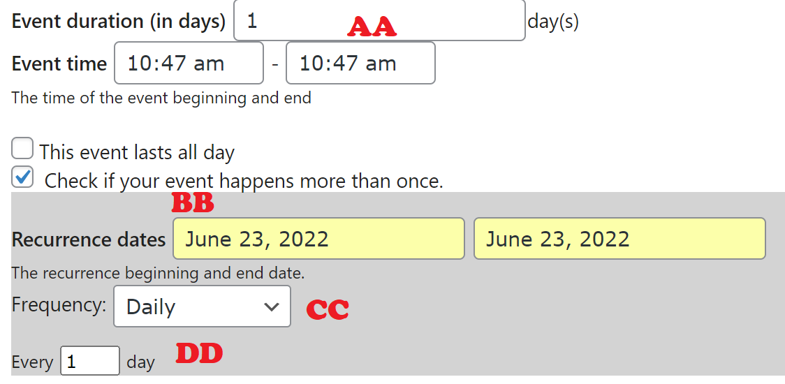
AA. Event duration in days: almost always 1.
BB. Recurrence dates: select duration for all of the dates that your event will be taking place.
CC. Frequency: Daily, Weekly, Monthly, annually and custom — for custom contact Creative Services.
DD. Every () day/week/month/year — is this every other day? Every Monday? Every month on the 4th?
Locations & RSVPs Tabs
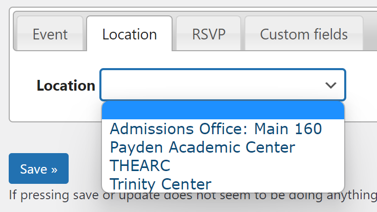
Locations Tab: Select from your existing locations. If a location is missing, save your draft event and click on the “Locations” item in your left nav to add location info. You have to include a full address in order to save the location. Then return to your draft event to select the new location.
Locations Tab: Select from your existing locations. If a location is missing, save your draft event and click on the “Locations” item in your left nav to add location info. You have to include a full address in order to save the location. Then return to your draft event to select the new location.

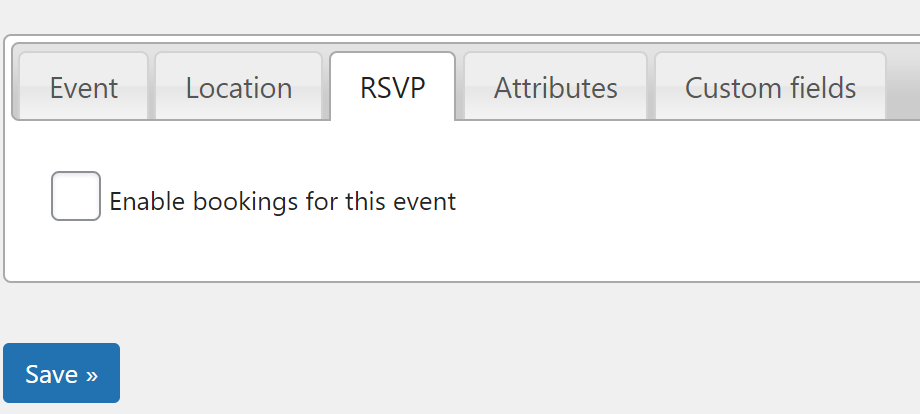
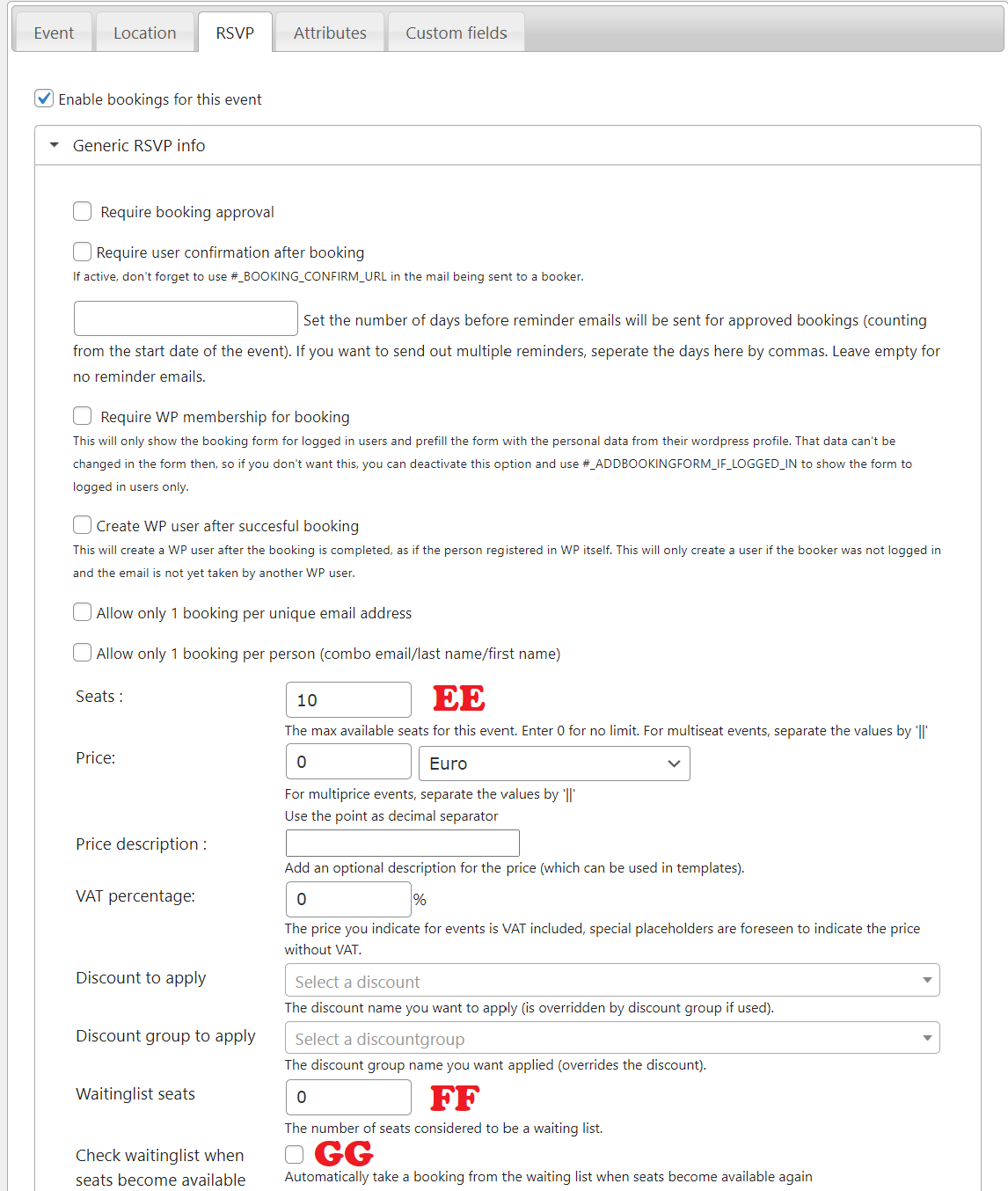
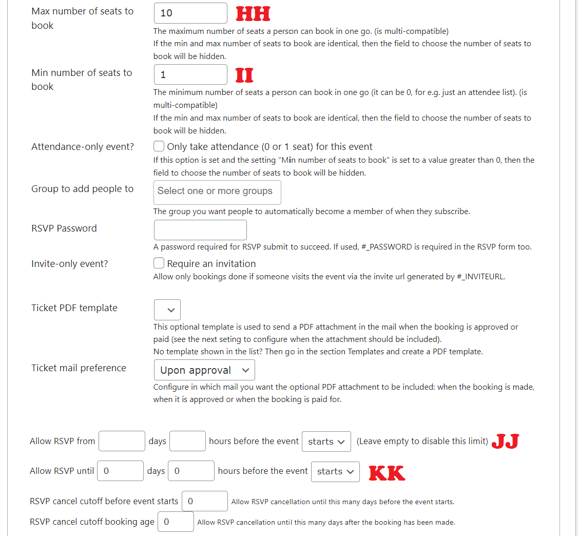
Events Tab: Click this checkbox to activate RSVPs, IF YOUR SITE IS SET UP FOR RSVPs (Contact Creative Services to see).
Tutorial Coming Soon
